Showing posts with label cpg. Show all posts

Friday, April 16, 2010

Record Store Day tomorrow


Ahh, Record Store Day: the national holiday commemorating the physical artifacts by which music used to be transmitted, and the cultural outposts set up to sell them. If you're local to Northside, check out Shake It Records, they're participating. That's tomorrow -- April 17th. Lots of limited-edition releases just for the occasion. Cocorosie, Bonobo, other good stuff.


David Byrne on the demise of music packaging in The Bicycle Diaries: "The era of the data cloud surrounding pop music as representative of a weltanschaung might be over."


Wednesday, April 08, 2009

Ridiculously Lean

Xerox brags about how much time they're going to save P&G:

Using Lean Six Sigma-based methodologies, Xerox Global Services will deliver an enterprise-wide strategy, expected to free up hundreds of minutes of employee time annually.


I can't figure out any way to legitimately read that sentence to mean "hundreds of minutes of time per employee," can you?


So it's time to get out the calculator.


Given that P&G has 138,000 employees, even if we're as generous as we can be and call it nine-hundred and ninety nine minutes, that still works out to less than half a second per employee, per year...

But how much time is really spent waiting for laserprints of regular Office documents anyway? Not much, compared to how much time a large design firm spends spooling gigabytes to presentation printers.

Friday, February 27, 2009

I hate refill streams

Painfully familiar rant at Gizmodo called Why I Now Hate Epson Printers, and the answer boils down to, they've taken the refill stream of ink cartridges to an almost DRM-ed level of insanity.

Familiar for me; I just trashed my Canon and replaced it with a $150.00 networkable black and white laser printer. At 3,500 pages between cartridges, I hope to go many years without having to suddenly run out to Staples in the middle of a print job.

Wednesday, October 01, 2008

Wednesday, September 10, 2008

Unilever tries extended-gamut

A division of Unilever is moving away from spot colors for their packaging printing. I would guess the six "process" inks are CMYK plus green and orange, like Hexachrome, or rich blue and orange -- seems like rich blues are more sought after than bright greens.


Most of the advantages to moving to such a system have to do with cutting makeready time, and allowing more flexibility to gang up unrelated labeling together. This might be more important in markets that require a lot of regional adaptation than it is here in the U.S...


Judging by a similar trial I've seen, a six color system still leaves a lot of colors a bit out of gamut. I also have to imagine that this isn't targeting traditional flexography. Small type on a flexo label, built out of two or three inks, would look pretty bad.


This system has serious implications for the design "end user." No area of the design could have more than four different inks in it, so the ordinary human brain wouldn't be trusted to pick colors directly: familiar desktop design applications won't give you a palette with six sliders in it. If I recall, the old Hexachrome system dictated that designers go over to an RGB workflow, with separations created by proprietary software once it left the desktop.


For most imagery, the designer would never know what the exact color build was. Instead, they would only know what the values in RGB on the desktop were, and color management software would do the rest.


So the color management business would have a lot to gain by adoption of extended gamut printing.


Thanks to David Johnson for the tip.

Thursday, August 28, 2008

Rules of design

From an article in Business Week about designing Coke:
Another example of working within the peculiar constraints of Coca-Cola is a Web-based software tool that Butler calls the Design Machine and describes as "the Nike ID of internal design." The tool allows designers at the company's many bottling partners to create new bottle or can label designs or even promotional posters. Because of parameters built into the tool, the final design will always conform to the global standards set by the corporate design team. The neat internal use of Web 2.0 technology cuts back on the need for top-down control from the brand managers in Atlanta, allowing greater brand flexibility.


I'd love to see what that looks like.

Saturday, March 01, 2008

Si usted no entiende la etiqueta...

Si usted no entiende la etiqueta....


Really funny text below the Caution Statement on this label for Clorox Disinfecting Kitchen Cleaner. Everything that appears on the label in English also appears in Spanish, so I'm not sure why they'd need to single out their Spanish speaking consumers to tell them what they should do if they couldn't understand it.

Monday, October 01, 2007

Canadian Signal Word Type Height Calculator

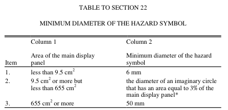
If you're in the business of designing packaging for Consumer Packaged Goods to be sold in Canada, you may have run across the amazingly complicated formula for calculating the size of the word "Caution" as it sits at the bottom of the package, warning the consumer not to drink the Drano, or what have you. The corresponding icons for "poisonous," "contents under pressure," etc. are quite punk rock, I will have to upload those later.

hazard.gif

So, this is the kind of thing you only have to do twice before it's safer and easier to offload the entire calculation off to the computer.

#! usr/bin/perl
# a formula used to calculate size of "signal word" for Cdn cautionary copy.
# Find diameter of a circle with an area equal to 3% of the PDP.
# That's how big any required symbol needs to be.
# The signal word then has to be 1/4 that size.

use Math::Complex;
use constant PI => 4 * atan2(1, 1);
print "enter the X dimension of your PDP in centimeters\n";
my $xDim = (<\STDIN\>);
print "enter the y dimension of your PDP in centimeters\n";
my $yDim = (<\STDIN\>);
my $PDPArea = $xDim * $yDim;
my $SignalWordHeight = (sqrt(($PDPArea * .03)/PI))/2;

printf "the area of the principal display panel is %.3f cm square, and the signal word should be at least %.3f cm high.\n", $PDPArea, $SignalWordHeight;

Update: Had to escape "STDIN" with backslashes for Blogger. Remove before use.

Saturday, September 29, 2007

Visualization

In which I start out talking about decision trees, and end up talking about shelf sets.

Matt Neuburg has an interesting writeup at Tidbits of a decision making tool called Flying Logic. The program creates "intelligent" decision trees that provide visual feedback as to how to navigate the complex web of dependencies required in order to get to a goal.

Yes, you can do this with a whiteboard (or Omnigraffle), but those don't let you offload logic out of your head.

This is a tool that's probably only worth checking out for major initiatives, but more broadly, the power of visualization in aiding group decision-making can't be overstated. Without visual reference, planning meetings are essentially Socratic dialogs, which is unnecessarily hard work.

Even in the world of brand design, I am often sitting in a meeting talking about "the chosen design" and what needs to happen to it... without any visual reference. Looking around the table, you can see everyone's eyes focussing off in the middle distance as we recall what that design looked like. More unnecessarily hard work.

Think ahead about what needs to be in your library of visual reference material, and keep it at hand in your team's public discussion areas. For CPG design, this means comprehensive shelf sets, and reference for visual equity elements and physical materials. Don't have your meetings in conference rooms, you'll just have to bring your stuff there, and that's too much work, so you won't.

Sunday, September 23, 2007

About a certain type of article which seems to be typical of the New Yorker

Simulacra in the high culture bazaar.... (via BoingBoing)

There was an interesting article by James Surowiecki in the New Yorker this week about fashion design knockoffs, and the unacknowledged link in the chain of commerce which they play:

The paradox stems from the basic dilemma that underpins the economics of fashion: for the industry to keep growing, customers must like this year’s designs, but they must also become dissatisfied with them, so that they’ll buy next year’s.

It seems the real depends upon the simulacra in order to exist, or at least to have value.

There have been many other articles about the phenomenon of the simulacra over the past few years in the New Yorker. Here's a few off the top of my head:

  • Calvin Trillin's claim that white wine served at room temperature tastes just like red wine if you close your eyes (I think Cal should stick to food writing).
  • The story I blogged earlier about Argentinian sunflower-seed oil etc. being labeled as extra-virgin Italian olive oil.
  • Last week's incredible story about Joyce Hatto, the greatest pianist who never was, and her Svengali-like husband, who assembled hundreds of Joyce Hatto CDs out of bits and bobs of other recordings, and turned her into a star, until the hoax was discovered. I liked the bit at the beginning about the cottage industry of recordings issued under false names.
  • The story the week before that about the hard-working counterfeiter of bottles of wine reputed to have belonged to Thomas Jefferson, which sold to collectors for hundreds of thousands of dollars. Robert Parker was a fan.

Each of these articles takes as their subject a culturally freighted pleasure which forms one of the cornerstones of their target demographic's highbrow, luxury lifestyle: gourmet food, wine auctions, classical music, haute couture. In each case, received wisdom about the hierarchy of the Good is tested: blindfolded, could you tell white wine from red? How can critics praise the same recordings when attributed to Joyce Hatto which they dismissed when presented under their true performer's name? If a blind stranger came to dinner and you served him dog food, how much trouble would you be in when he turned out to be Wotan?

I guess part of what this supports is the idea that with the New Yorker you get the unvarnished truth, including cultural metacriticism.

So what is clearly needed to complete these categories of counterfeitings is a story about a literary fiction. It's surprising the Raymond Carver - Gordon Lish authorship dispute never made it to their pages.

But yes: in this aisle of culture, the New Yorker is a producer, not a critic.

Saturday, August 18, 2007

the desert of the real

There was a lot of chat about China in the office this week -- the Mattel recall, the melamine in the pet food, et cetera. Since this town is the former home of Hasbro, there are a lot of connections to the toy industry, and of course we make our living embellishing the brand promise for the Consumer Packaged Goods sector.

But the China story that got me was the one about the counterfeit NEC factory -- not just an anonymous building secretly turning out fake NEC electronics, a fake NEC factory turning out fake NEC electronics.

To the extent that consumer brands form the epistemological bedrock of a consumer society, this pretty much undermines everything. It's like the Ship of Theseus which sailed out on a long voyage, over the course of which, every plank and rope was replaced... with cheaper components of unknown origin... sourced from the global marketplace...

I also dug this one up out of my del.icio.us tags, the story of a simulated Disneyland in China. Funny that one of the complaints the Japanese had about this simulacra was that the talent kept taking the giant heads off of their costumes, breaking the fictive dream.

Sunday, February 04, 2007

Victor Hugo a habite cette maison


Browsing for chocolate in Brussels feels like going to the jewelry district. And neither chocolate nor diamonds can be found in the Belgian earth.