- Nosaj Thing, Drift, Alpha Pup
- The Embassadors, Coptic Dub, Nonplace
- Radian, Chimeric, Thrill Jockey
- Dwayne Sodahberk, Interdikt, Tigerbeat6
- Fuck Buttons, Tarot Sport, ATP Recordings
- Cluster, Qua, Nepenthe
- XX - Xx, Young Turks
- Thao, Know Better Learn Faster, Kill Rock Stars
- Do Make Say Think, Other Truths, Constellation
Wednesday, December 30, 2009
New music I liked the most in 2009
Thursday, November 12, 2009
Talking Heads
Every information technology has its particular limitations and specialties, which define the ways in which it can present its information. These conditions evolve into the formation of a style.
I think of this phenomenon every time I'm listening to NPR and the sound guy has designed in all these auditory cues -- cowbells dinging and cattle lowing behind the reporter's voiceover, or what have you.
But sometimes the style persists even after the initial limitations have melted away, and that's interesting.
Example: The first newspapers were printed in black ink on letterpress. Thus they were restricted to the written word and -- initially -- the engraved illustration style. One side effect of these restrictions was that the illustrator could play a real dramatic role in influencing the storytelling (drawing things that never happened, for one extreme).
If you look at a current issue of the New Yorker, you can see a continuation of this style which persists now not because of technological need, but to reach a particular audience which has been prepared by newspapers to prefer its information to be delivered in a particular way. Lots of column inches, set off by illustrations. I mean, they have artists create caricatures to accompany their movie reviews -- who does that? It's not like they have to send Robert Risko to the sound stage to sketch the actors. At this point, the aesthetic is a stylistic choice.
The New Yorker looks the way it does to please the aesthetic of the magazine's creators and audience, and this is all right and proper. But this aesthetic has been more formed by technological constraints than we know.
Television, of course, is the new newspaper, defining an aesthetic for pretty much everybody now.
When I look at the video library on Businessweek.com, I see an information delivery technology which inherits the aesthetic of television, with clickable rows of talking heads instead of a sequence of talking heads, and I have to wonder what the Web would look like if it hadn't been preceded by both the newspapers and television.
I also can't figure out whether what I'm looking at is information-sparse or information-dense. One thing's for sure -- it'd take a whole lot of clicking and watching to find out.
Monday, October 05, 2009
Krautdub
Some places on Earth seem to be musical loci: Kingston, Bamako, the Lower East Side. I just realized how much of the most interesting music I have been listening to lately comes from Cologne. Sonig and Nonplace are two great Kölner labels.
Nonplace in particular seems to have picked up where Can and Cluster left off, continuing to base the music in live instrumentation, but noodling over it fairly thoroughly on the computer afterwards.
For example, The new album from the Embassadors sounds absolutely smokin'. The individual musicians recorded their tracks in different cities over a couple of years, and it was all assembled in the Nonplace studio.
Way more interesting than most purely electronic music, this is using the computer as a bricoleur to assist in the assembly of ever-denser human sound-artifacts.
I'm also reminded of something Brian Eno said he was aiming for when he was assembling Nerve Net. He said he was looking to create music that sounded like it was created by "African robots."
Also regarding the intersection of the robotic and the human in music, David Byrne wrote some amusing liner notes to go with his curation of partly-Kölner music a while back.
Thursday, October 01, 2009
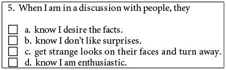
I Am Enthusiastic
We're all getting free personality testing at work. I'm excited to see what will be done with the data.
Friday, September 18, 2009
Nostalgia for the Now
Someone was telling me a story about how they were in traffic the other day watching the driver of the car next to them actually reading a newspaper folded across his steering wheel while he drove. Standard trope about distracted driving.
How far we've come from the days when you put on goggles and driving gloves before you got behind the wheel -- it was almost like an athletic event, certainly physically and mentally demanding, requiring knowledge and concentration to keep the elaborate contraption running. Every car was a sports car.
But closed cabins took away the need for driving goggles; automatic transmission, power steering and brakes made athleticism unnecessary; the roads were paved; seat belts and air bags were put in place to protect our frail bodies. We grew quite comfortable in our driving lives.
Now, out of our comfort, we grow careless, and the engineers invent car radar to keep us safe. How far away can full autopilot be?
It suddenly seems like this moment is a kind of dangerous valley, where we've already mentally given up control of our fate to the machines, even though the engineers haven't quite gotten them fully finished for us.
And it reminds me of something Bill Joy famously quoted in his article about Grey Goo:
I prefer to think of this a bit metaphorically, not just as the individual giving up control of his fate to a machine, but as the individual benefiting from the creations of the group. The robot is really a stand-in for the ever-more-complex apparatus of society.
But for now, anyone is still free to wake up and drive like an athlete, mindfully inhabiting the present moment, fully in charge of the ton of steel they're riding down the road.
How far we've come from the days when you put on goggles and driving gloves before you got behind the wheel -- it was almost like an athletic event, certainly physically and mentally demanding, requiring knowledge and concentration to keep the elaborate contraption running. Every car was a sports car.
But closed cabins took away the need for driving goggles; automatic transmission, power steering and brakes made athleticism unnecessary; the roads were paved; seat belts and air bags were put in place to protect our frail bodies. We grew quite comfortable in our driving lives.
Now, out of our comfort, we grow careless, and the engineers invent car radar to keep us safe. How far away can full autopilot be?
It suddenly seems like this moment is a kind of dangerous valley, where we've already mentally given up control of our fate to the machines, even though the engineers haven't quite gotten them fully finished for us.
And it reminds me of something Bill Joy famously quoted in his article about Grey Goo:
Eventually a stage may be reached at which the decisions necessary to keep the system running will be so complex that human beings will be incapable of making them intelligently. At that stage the machines will be in effective control. People won't be able to just turn the machines off, because they will be so dependent on them that turning them off would amount to suicide.
I prefer to think of this a bit metaphorically, not just as the individual giving up control of his fate to a machine, but as the individual benefiting from the creations of the group. The robot is really a stand-in for the ever-more-complex apparatus of society.
But for now, anyone is still free to wake up and drive like an athlete, mindfully inhabiting the present moment, fully in charge of the ton of steel they're riding down the road.
Thursday, August 13, 2009
Hire slowly, fire quickly. At a cocktail party.
"Hire slowly, fire quickly" is a Jack Welchian adage. This post at the always-interesting Signal Vs. Noise explains one reason why growing companies should bear it in mind.
Friday, May 29, 2009
Hard Drive Formatting on Mac OS X
If you're using a Mac, Disk Utility should be your first stop after plugging in a new drive, which will probaby come formatted for Windows. Windows formatted drives are not unusable on the Mac, but are also not optimal. This is a good article by Matt Neuburg about the proper settings to use.
It's painful to have to redo these settings if you don't get them right while the disk is still bare...
It's painful to have to redo these settings if you don't get them right while the disk is still bare...
Wednesday, April 15, 2009
How real is real?
Go read this thought provoking news item about how much Photoshoppin' is acceptable in photojournalism.
In a nutshell, a Danish photojournalist turned the saturation and contrast in his RAW files up to 11, as is the fashion these days in editorial / design photography, and entered them into a contest. Judges said, that's not what journalism looks like, and demanded to see his RAW files for comparison.
It's interesting to see how those original files are needed to stand in for some kind of objective reality. It's not as if stuff like this wasn't possible in pre-digital darkrooms, and it's not like you can ever view a RAW file without some rendering/intent decisions being made -- either by you or some software engineer.
Nobody's asking me, but I would say there's a big difference between local and global adjustments. Anything you can do to a digital file without making a selection falls in to one level of manipulation, and anything involving a selection or other pixel-pushing (layer, mask, rubberstamping, etc) falls into another. Any time you open a RAW file in Photoshop, you're already at level one.
And this bit is just incorrect:
"He deliberately chose a chair and made it yellow, and so he chose the wall and made the blue," said Peter Dejong. "For me it is unacceptable."To me it seems like the area in question is well within the possibilities of global color adjustment from RAW.
From John Nack.
(Update -- machine-translated link above can be wonky; here's a page on the original site -- in Danish.)
Adobe UI Gripes
Adobe UI Gripes is an awesome kvetch-blog with plenty of screenshots of the funny things that happen when Marketing makes the decision about when the software is ready to ship. I can already think of an error message dialog I need to screen capture next time I see it.
Wednesday, April 08, 2009
Ridiculously Lean
Xerox brags about how much time they're going to save P&G:
Using Lean Six Sigma-based methodologies, Xerox Global Services will deliver an enterprise-wide strategy, expected to free up hundreds of minutes of employee time annually.
I can't figure out any way to legitimately read that sentence to mean "hundreds of minutes of time per employee," can you?
So it's time to get out the calculator.
Given that P&G has 138,000 employees, even if we're as generous as we can be and call it nine-hundred and ninety nine minutes, that still works out to less than half a second per employee, per year...
But how much time is really spent waiting for laserprints of regular Office documents anyway? Not much, compared to how much time a large design firm spends spooling gigabytes to presentation printers.
Thursday, March 12, 2009
Friday, February 27, 2009
I hate refill streams
Painfully familiar rant at Gizmodo called Why I Now Hate Epson Printers, and the answer boils down to, they've taken the refill stream of ink cartridges to an almost DRM-ed level of insanity.
Familiar for me; I just trashed my Canon and replaced it with a $150.00 networkable black and white laser printer. At 3,500 pages between cartridges, I hope to go many years without having to suddenly run out to Staples in the middle of a print job.
Familiar for me; I just trashed my Canon and replaced it with a $150.00 networkable black and white laser printer. At 3,500 pages between cartridges, I hope to go many years without having to suddenly run out to Staples in the middle of a print job.
Saturday, February 07, 2009
The Future of the Layers Palette
John Nack, product manager for Photoshop, requests input on ways to improve the interface for managing the increasingly complex variety and number of layers in a typical design PSD. This should sound familiar:
People end up heavily overloading the few tools they've got--layer names, layer visibility, and nesting layers into folders/groups. Naming conventions work up to a point, but they're clumsy and fragile.
The Layers palette is really a simple outliner of visual data right now, and a lot of the ideas Nack proposes have to do with ways to make that outliner better able to respond to the need for a more automated, error-free design pipeline.
It is a quick and anonymous survey so I encourage you to fill it out if you would be affected by these changes. The last time I took an Adobe survey I got a personal follow-up; it seems like maybe they're finally getting on the clue train.
Saturday, January 17, 2009
Brutalism
Since we just sit in the gloom staring at screens all the time.
Sunday, January 11, 2009
Font Explorer Pro
Linotype just launched a Pro version of Font Explorer; Jon Hicks blogged about the icon he made for it.
I like the way the current, standalone version feels; it's like iTunes for fonts, replete with a Store. But mostly I'm just rooting for Linotype to give Suitcase some pro-level competition, since Suitcase + the Adobe Creative Suite = Wristwatch Land. It's pathetic that Linotype can use "Finally an auto-activation function that really works!" as a sell line.
Hmmm, the blurb on the brochure says that "...Landor will definitely be switching..."
Subscribe to:
Comments (Atom)